
A high-converting landing page does one thing: it moves a specific visitor toward a single, defined action. No navigation menu pulling attention elsewhere, no competing CTAs, no sections that exist for reasons other than answering a visitor's next question. The structure is a guided decision path, not a general-purpose web page.
The essential components, in the order visitors need them:
- Hero / Unique Value Proposition (UVP): Establishes fit and outcome in the first screen
- Mechanism / context block: Shows how the outcome is delivered
- Social proof: Testimonials, metrics, and logos that make the promise believable
- Offer and terms: Price, what's included, risk-reduction (guarantee, free trial)
- Primary CTA / conversion element: The one action you want taken, repeated at the right moments
- Reinforcement block: FAQ, secondary proof, or objection handling that catches late doubters
Every section in this guide maps to one of those jobs. Use it as a blueprint when you build a landing page from scratch, or as an audit rubric when an existing page underperforms.
Key Takeaways
A high-converting landing page follows a single guided decision path: one goal, one dominant CTA, and sections ordered to answer visitor questions in the sequence promise → proof → action.
| Point | Details |
|---|---|
| One goal per page | Remove navigation and competing CTAs; every section must serve the single conversion goal. |
| Section sequencing matters | Order blocks to answer: Is this for me? What will I get? Why trust it? What do I do next? |
| Proof placement is structural | Move your strongest testimonial above the CTA, not below it, for higher conversion reliability. |
| Mobile performance is non-negotiable | Target a Largest Contentful Paint under 2.5 seconds; repeat the CTA after every two blocks on mobile. |
| Aria consolidates the build-and-test stack | Aria replaces multiple subscriptions with one platform covering page building, forms, CRM, and analytics. |
Table of Contents
- What does a complete landing page structure look like?
- How to write a hero section that qualifies visitors immediately
- How to design CTAs and forms that reduce friction
- Which social proof types work best and where to place them
- How to write benefits-first copy that actually converts
- How to lay out a landing page: a wireframe you can use today
- How does landing page structure change by page type and goal?
- Mobile, performance, and accessibility: the technical checklist
- How to run A/B tests that actually improve your landing page
- Three annotated templates you can copy right now
- The one principle that explains why structure beats design
- What I would fix first on an underperforming landing page
- Aria makes it faster to build, test, and iterate
- Sources
What does a complete landing page structure look like?
Before going section by section, here is the full anatomy as a checklist you can use to audit any page in under five minutes. Practical anatomy resources confirm that removing site navigation on paid landing pages and ordering sections to answer visitor questions in sequence improves conversion reliability.
Essential blocks (required for every page type):
- Above-the-fold: headline, subhead, hero image or video, primary CTA button
- Context / outcome block: who this is for and what they get
- Mechanism: how the product or service delivers the result
- Social proof: at least one proof type (testimonial, logo row, or metric)
- Offer and terms: pricing, what's included, guarantee or risk reversal
- Primary CTA: repeated at least twice (above-the-fold and at page bottom)
- Reinforcement / FAQ: handles final objections before the visitor leaves
Short vs. long decision journeys:
Short journeys (low-cost, low-risk offers) can compress mechanism and proof into a single block and skip a detailed FAQ. Long journeys (high-ticket, complex, or B2B offers) need deeper mechanism explanation, multiple proof types, and a full objection-handling section.
Immediate technical gates (check these before anything else):
- Navigation links removed or hidden on the landing page
- Page load under three seconds on mobile
- CTA button visible without scrolling on desktop and mobile
- Single conversion goal per page (no secondary opt-ins or competing links)
How to write a hero section that qualifies visitors immediately
The hero section is where most pages lose visitors, and most of the time the problem is a headline that describes the product instead of the outcome. A headline that qualifies visitors states who the page is for, what they will get, and what constraint it removes, all in one line.
Headline formulas that work:
- Outcome + audience: "Grow your coaching practice to $10K/month without paid ads"
- Problem removed + result: "Stop losing leads to slow follow-up. Automate your pipeline in a day."
- Specific metric + timeframe: "Book 30% more appointments in 60 days, or your money back"
The subhead does a different job. It names the mechanism briefly and reduces perceived risk. Keep it to two lines maximum.
Support media guidance:
- Use a product screenshot or demo video when the mechanism is hard to visualize from copy alone. Use a lifestyle image when the emotional outcome is the primary driver. Use an illustration when the product is abstract or data-heavy. Avoid decorative stock photography that has no relationship to the UVP as it dilutes trust.
Above-the-fold visibility rules:
- Logo: present but unlinked (clicking it should not navigate away)
- CTA button: visible without scrolling, labeled with the action and outcome ("Get my free audit," not "Submit")
- Trust cue: one short line ("Trusted by 4,200 creators" or a single recognizable logo) placed near the CTA
Pro Tip: Run two headline variants simultaneously using your page builder's A/B or duplication feature. Keep everything else identical. The winning headline is the one with a higher scroll-past-hero rate, not just a higher click rate on the CTA, because a good headline pulls visitors into the page rather than bouncing them.
Design guides recommend matching form placement to visitor intent: a form in the hero works for simple, low-friction offers, while a button-only hero works better for considered purchases where visitors need more context before committing.
How to design CTAs and forms that reduce friction
The CTA is not just a button. It is the moment where your page's promise meets the visitor's willingness to act. Every design decision around it, from wording to color to field count, either adds or removes friction.
CTA wording and hierarchy:
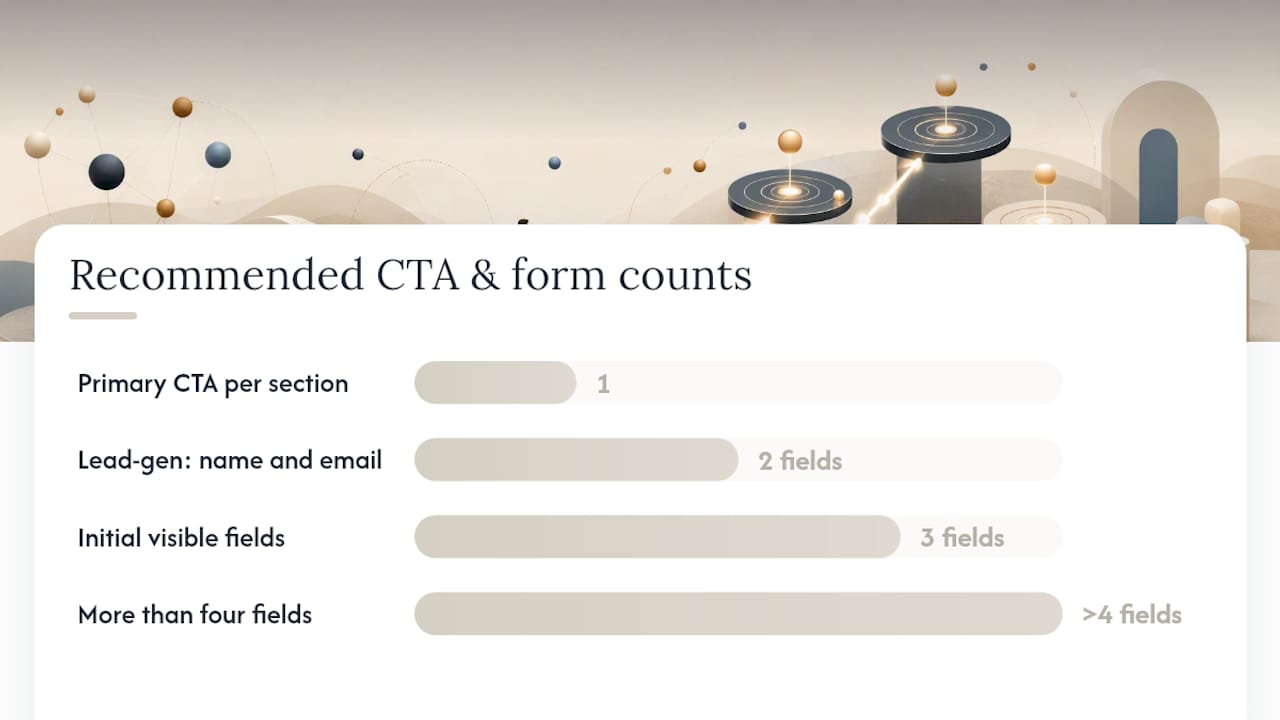
- Primary CTA: one per page section, action-oriented, outcome-specific ("Start my free trial," "Book a call," "Get the template")
- Secondary CTA: lower visual weight (ghost button or text link), used only when a meaningful segment of visitors needs a different next step ("See how it works" linking to a demo video)
- Never place two primary CTAs side by side; the visual competition reduces clicks on both
Form design rules:
- Ask for the minimum data needed to take the next step. For a lead-gen page, name and email is usually enough.
- Use progressive disclosure for longer forms: show three fields, then reveal the rest after the visitor starts filling in. Completion rates improve when the form feels shorter at first glance.
- Place a single form or a single button per page section. Two forms on the same screen split attention.
- For high-intent traffic (paid search, retargeting), a form in the hero converts well. For cold traffic (social ads, content), a button-only hero that leads to a form on the next screen often works better.
- Add a privacy microcopy line directly below the submit button ("We never sell your data. Unsubscribe anytime.") to reduce hesitation at the moment of commitment.
Form friction checklist:
- Field labels visible above each input
- Inline validation that confirms correct input immediately
- Clear error messages that say what to fix
- A privacy link near the form linking to your data policy
- Submit button copy that reflects the next step
Pro Tip: If your form has more than four fields and your conversion rate is below target, remove one field at a time and retest. The field most often removed without hurting lead quality is the phone number, unless your sales process requires it.
Lead-gen and click-through pages differ structurally: click-through pages educate visitors and push them toward a next step, while lead-gen pages capture data on-page with a form as the primary CTA. Choosing the wrong type for your traffic source is one of the most common structural mistakes.
Which social proof types work best and where to place them
Proof is not decoration. Each proof type answers a specific visitor objection, and placing it in the wrong position on the page means the objection goes unanswered at the moment it arises.
Proof types and their primary jobs:
- Testimonials: Answer "Will this work for someone like me?" Place near the CTA or after the mechanism block, where the visitor has just learned how the product works and needs confirmation it works for real people.
- Client logos: Answer "Is this a credible company?" Place early, in or just below the hero, as a fast credibility signal for cold visitors.
- Case metrics: Answer "What result can I realistically expect?" Place after testimonials or in the benefits section, where a specific number ("Reduced churn by 34%") reinforces a benefit claim.
- Review snippets (star ratings, platform badges): Answer "What do independent sources say?" Place near the CTA or in the offer section, where risk is highest.
- Security badges and certifications: Answer "Is my data safe?" Place at the form or checkout, exactly where the visitor is asked to share personal or payment information.
Placement rules in practice:
A logo row immediately below the hero headline works as a fast trust signal for B2B pages. A testimonial carousel mid-page, placed after the mechanism block, works for considered purchases. A single strong quote with a name, photo, and job title placed directly above the CTA is one of the highest-impact proof placements on any page type.

Micro-trust signals (SSL badge, "No credit card required," a link to your privacy policy) belong at friction points, which means at the form and at the checkout step, not scattered across the page.
How to write benefits-first copy that actually converts
Most landing page copy describes features. Visitors buy outcomes. The gap between those two things is where conversion rates drop.
The problem → outcome → benefit microstructure:
Every paragraph or bullet on a landing page should follow this sequence:
- Problem: Name the specific frustration or gap the visitor is experiencing
- Outcome: State what changes after using the product
- Benefit: Explain why that change matters to this specific visitor
Applied to a single bullet: "Chasing invoices manually wastes hours every week [problem]. Aria's automated billing sends, tracks, and follows up without you touching it [outcome]. You get paid faster and spend that time on client work instead [benefit]."
Feature-to-benefit translation template:
- Feature: "Automated email sequences"
- Bridge: "which means"
- Benefit: "your leads get followed up even when you're offline"
Run every feature claim through this template before it goes on the page. If the bridge phrase sounds forced, the feature is not yet a benefit.
Subhead and bullet formatting for fast scanning:
- Lead each bullet with the benefit, not the feature name
- Bold the first three to five words of each bullet so skimmers catch the key point
- Keep bullets to one sentence; two at most
- Use subheads every 150–200 words to give the eye a resting point and signal the next idea
Microcopy tips:
- CTA button: use first-person phrasing ("Get my report" outperforms "Get your report" in most tests)
- Form field labels: be specific ("Work email" rather than "Email") to reduce friction and set expectations
- Error states: always tell the visitor what to do, not just what went wrong
How to lay out a landing page: a wireframe you can use today
A wireframe is a section-by-section blueprint that tells your designer and copywriter exactly what goes where and why. Here is a sequence that works for most offer types, ordered by the decision question each block answers.
Step-by-step wireframe sequence:
- First screen (hero): Headline, subhead, hero image or video, primary CTA button, one trust cue
- Context / outcome block: Two to three sentences on who this is for and what they will achieve
- Mechanism block: Three to five steps or feature highlights showing how the result is delivered
- Proof block: Two to three testimonials, a logo row, or a case metric panel
- Offer and terms: Price, what's included, guarantee or risk reversal statement
- Primary CTA (repeated): Same button copy as the hero, placed after the offer
- Reinforcement / FAQ: Three to five questions that handle the most common objections
Visual hierarchy rules:
- Typography scale: headline at 48–64px, subhead at 20–24px, body at 16–18px (desktop). Scale down proportionally for mobile, but never below 16px body text.
- CTA button color: use a color not used elsewhere on the page for the primary CTA. Contrast with the background is more important than brand color consistency.
- Whitespace: give each block a clear top and bottom margin (60–80px on desktop, 40px on mobile). Crowded sections read as lower quality.
Short vs. long page notes:
Short pages (three to five blocks) work for warm traffic, retargeting, and simple offers. Long pages (seven or more blocks) work for cold traffic, high-ticket offers, and complex products where the visitor needs to understand the mechanism before they trust the proof.
Mobile-first responsive constraints:
- Stack all columns to a single column on mobile
- Move the CTA button to a sticky bar at the bottom of the screen on mobile, or repeat it after every two blocks
- Compress the mechanism block to icons with short labels rather than full paragraphs
- Test the hero on a 375px viewport before publishing
How does landing page structure change by page type and goal?
The anatomy described above is a default. The right landing page layout for a lead-gen campaign looks different from a click-through product page, which looks different again from a booking or event signup page.
Page types and their structural rules:
- Lead-gen page: Form is the primary CTA. Place it in the hero for simple offers (newsletter, free resource). Move it below the mechanism block for complex offers (consultation, audit). KPI: form completion rate and cost-per-lead.
- Click-through page: No form. A single button pushes the visitor to a product page, checkout, or app store listing. The page's job is to warm and qualify. KPI: click-through rate to the destination page.
- Product / sales page: Longer format. Includes a detailed mechanism section, multiple proof types, a full pricing block, and a FAQ. KPI: purchase conversion rate and revenue per visitor.
- Booking / appointment page: Combines a short lead-gen form with calendar availability. High-converting booking pages emphasize clear booking terms, visible availability early, and forms that collect only the fields needed to confirm the appointment. KPI: booking completion rate.
- Event signup page: Urgency and date specificity are structural requirements. The hero must include the event date, format (live vs. recorded), and a clear benefit for attending. KPI: registration rate.
How to adjust section order by funnel stage:
Cold traffic (social ads, display) needs more context and proof before the CTA. Warm traffic (email list, retargeting) can see the CTA earlier because trust is already partially established. Paid search traffic has high intent and often converts on a shorter page with a form in the hero.
Structural differences between lead-gen and click-through pages are significant enough that using the wrong template for your traffic source will cost you conversions regardless of how well the copy is written.
Mobile, performance, and accessibility: the technical checklist
A page with a perfect structure still fails if it loads slowly on mobile or breaks for users relying on keyboard navigation. These are not edge cases.
Mobile commerce represents a large and growing share of retail transactions globally, which means a landing page that performs poorly on mobile is leaving a significant portion of potential conversions on the table.
Performance checklist:
- Inline critical CSS so the above-the-fold content renders without waiting for a full stylesheet download
- Compress and serve images in WebP format; use responsive image sizes (
srcset) so mobile devices download smaller files - Lazy-load images and videos below the fold
- Limit custom fonts to one or two weights; use
font-display: swapto prevent invisible text during load - Target a First Contentful Paint under 1.8 seconds and a Largest Contentful Paint under 2.5 seconds (Google's Core Web Vitals thresholds)
Mobile layout rules:
- Stack all multi-column layouts to a single column
- Increase tap target size to at least 44x44px for all buttons and links
- Repeat the CTA button after every major section, or use a sticky CTA bar at the bottom of the viewport
- Reorder blocks if needed, but never break the promise → proof → action sequence
- Test on real devices, not just browser emulators
Accessibility checklist:
- Use semantic HTML:
<h1>for the headline,<h2>for section headings,<label>elements tied to every form input - Maintain a color contrast ratio of at least 4.5:1 for body text and 3:1 for large text (WCAG AA standard)
- Ensure all interactive elements are reachable and operable by keyboard alone
- Add descriptive
alttext to all images that carry meaning - Set a logical focus order so keyboard users move through the page in the same sequence as visual users
How to run A/B tests that actually improve your landing page
Most A/B tests fail to produce useful results because they test cosmetic changes (button color, font size) instead of structural ones. A structured build-and-test approach that identifies the audience, defines one wanted action, and tests major structural variables is the reliable path to optimization.
Testing checklist:
- Write a hypothesis before you build the variant: "Moving the testimonial block above the mechanism block will increase form completions because visitors need proof before they care about how the product works."
- Test one structural variable at a time. Moving the CTA and changing the headline simultaneously makes it impossible to know which change drove the result.
- Calculate the sample size you need before you start. A test that ends when you feel good about the numbers is not a test.
- Set a minimum detectable effect of 10–20% relative improvement. Smaller effects require sample sizes most pages cannot reach in a reasonable time.
- Run the test for at least one full business cycle (usually two weeks minimum) to account for day-of-week variation.
Prioritized structural experiments (highest impact first):
- CTA placement: move the primary CTA above the fold if it currently sits below it
- Form length: remove one field at a time and measure completion rate
- Proof placement: move a strong testimonial from mid-page to directly above the CTA
- Headline variant: test an outcome-focused headline against a problem-focused one
- Page length: test a compressed version (remove one block) against the full page for warm traffic
Analytics setup:
- Track form starts and form completions as separate events, not just the thank-you page view
- Set up a conversion funnel in your analytics tool that shows drop-off between each major section
- Use UTM parameters consistently on all ad traffic so you can attribute conversion rate changes to specific campaigns
Pro Tip: The most common interpretation mistake in A/B testing is calling a winner too early. Set your significance threshold at 95% confidence before you start, and do not check results daily. Daily checking inflates the false-positive rate and leads to shipping variants that do not actually outperform the control.
Three annotated templates you can copy right now
These three patterns cover the most common page goals. Each one maps directly to the wireframe sequence above, with notes on where to compress or expand.
Template 1: Short lead-gen page (warm traffic, simple offer)
- Hero: outcome headline + subhead + email capture form + one trust cue
- Benefits: three bullets (problem → benefit format)
- Proof: one testimonial with name, photo, and specific result
- CTA: repeated button below proof
Compress: Skip the mechanism block. Warm visitors already understand how the product works. Expand: Add a second testimonial if the offer is new and trust is lower than expected.
Template 2: Click-through product page (cold traffic, considered purchase)
- Hero: outcome headline + subhead + product image + "See how it works" button
- Context block: two sentences on who this is for
- Mechanism: three to five feature highlights with icons
- Proof: logo row + two testimonials
- Offer summary: price, what's included, guarantee
- CTA: "Get started" button linking to checkout or signup
Compress: Reduce testimonials to one for high-intent paid search traffic. Expand: Add a FAQ block for cold social traffic where objections are higher.
Template 3: Booking / appointment page
- Hero: service name + outcome + date/availability indicator + "Book now" button
- Brief mechanism: what happens during and after the appointment
- Proof: two to three short testimonials focused on the experience, not just the result
- Booking form: name, email, preferred time (three fields maximum)
- Terms: cancellation policy, confirmation process
Effective booking pages keep forms short and make availability visible early. Visitors who cannot see open slots abandon before reaching the form.
Checklist for swapping visuals and copy without breaking the flow:
- Replace the hero image with one that shows the same outcome (not a different product or context)
- Keep the same headline formula even when changing the specific wording
- Do not add a new section type without removing one; total block count should stay the same unless you are deliberately testing page length
The one principle that explains why structure beats design
The principle is simple: a landing page is a corridor, not a lobby. A lobby invites exploration. A corridor moves people in one direction. Every structural decision should make the corridor narrower and the exit clearer.
A conversion-focused structure should establish relevance, clarify value, reduce risk, direct action, and preserve momentum after the action is taken. Each section answers one decision question in sequence.
Map your sections to visitor questions:
- Hero: "Is this for me?"
- Context / outcome block: "What will I get?"
- Mechanism: "How does it work?"
- Proof: "Why should I trust this?"
- Offer and terms: "What does it cost and what's the risk?"
- CTA: "What do I do next?"
- FAQ / reinforcement: "What if I still have doubts?"
A section that does not answer one of these questions is a lobby element. Remove it.
Checklist to operationalize the principle:
- Label each section on your wireframe with the question it answers
- If two sections answer the same question, merge them
- If a section answers no question, cut it
- Check that the sequence follows promise → proof → action; reversing proof and mechanism is one of the most common structural errors
Mobile commerce growth makes the corridor principle more urgent on mobile, where attention is shorter and scrolling is more effortful. Every extra block on a mobile page is a reason to leave.
What I would fix first on an underperforming landing page
When a page is not converting, most teams reach for a new design. The fix is almost always structural, and it is almost always in the first screen.
Here is the order I would work through:
- Above-the-fold clarity: Does the headline name a specific outcome for a specific person? If it describes the product instead, rewrite it first.
- CTA prominence: Is the primary button visible without scrolling on mobile? If not, move it up or add a sticky bar.
- Navigation links: Are there any links in the header that lead off the page? Remove them. Removing navigation from paid landing pages is one of the most consistently documented structural improvements.
- Form friction: Count the fields. If there are more than four, remove one and retest before changing anything else.
- Proof placement: Is there at least one testimonial or trust signal visible before the visitor reaches the CTA? If not, move your strongest proof element up.
Teams often make structural changes without a clear owner. Assign one person to approve section-level changes, and require a written hypothesis before any structural test goes live. Without that governance, you end up with a page that has been edited by six people and optimized for nothing.
Aria makes it faster to build, test, and iterate
Cutting the cycle time between "idea for a structural test" and "live variant" is where most teams lose weeks. Aria's all-in-one platform is built for exactly that problem.
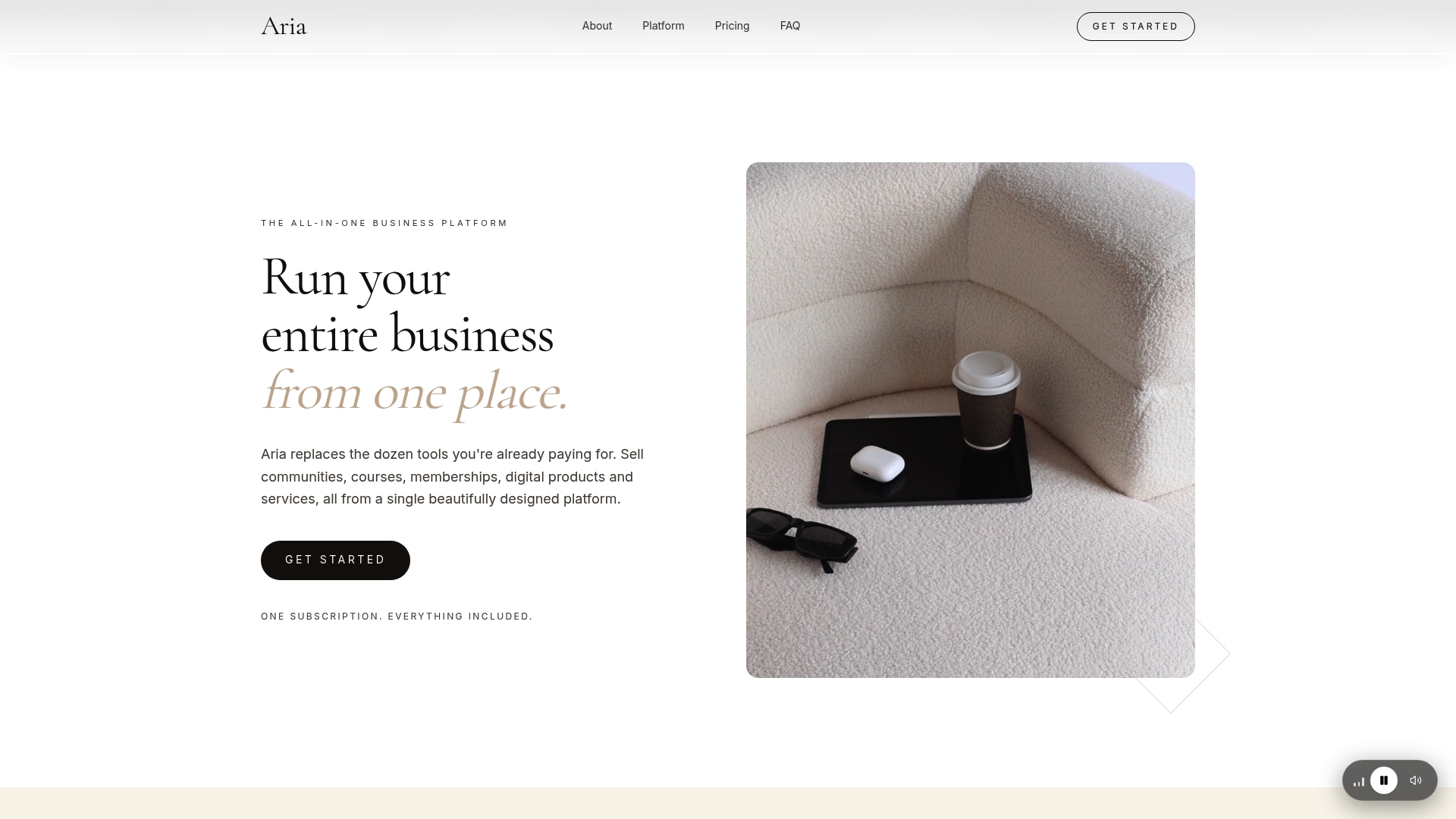
With Aria, you get website and funnel building, form handling, CRM, email and SMS marketing, and analytics integrations in a single subscription, replacing the stack of tools most teams currently stitch together. Duplicate a page in seconds to run a structural variant, manage your leads from the same interface where you built the form, and track conversion events without a separate analytics setup. Aria claims to save users over $700 in monthly tool costs compared to running those functions across separate subscriptions. For creators, coaches, and agencies who need to move fast without managing five platforms, that consolidation is the practical advantage. See what Aria includes and start your first landing page test from a template today.
Sources
These are the primary sources used to build this guide. Each one goes deeper on a specific aspect of landing page design and optimization.
- Landing page design: 8 essential elements with examples
- How to Build a High-Converting Landing Page (+ Examples)
- Retail mobile commerce revenue worldwide (Statista)
- Landing Page Anatomy: Every Section in Order, and Why | Glide
- Involve